


Blinds
How To Ensure Colour Match: Tips When Buying Blinds Online
Choosing blinds online should feel simple, yet colour mismatch is one of the most common frustrations homeowners face. Lighting differences, screen variations, and fabric textures can all affect how a shade appears once installed.
Getting it right the first time is less about guesswork and more about understanding how colour behaves in real spaces. With the right approach, you can confidently select blinds that complement your interiors and elevate your rooms.
Understand How Lighting Affects Colour
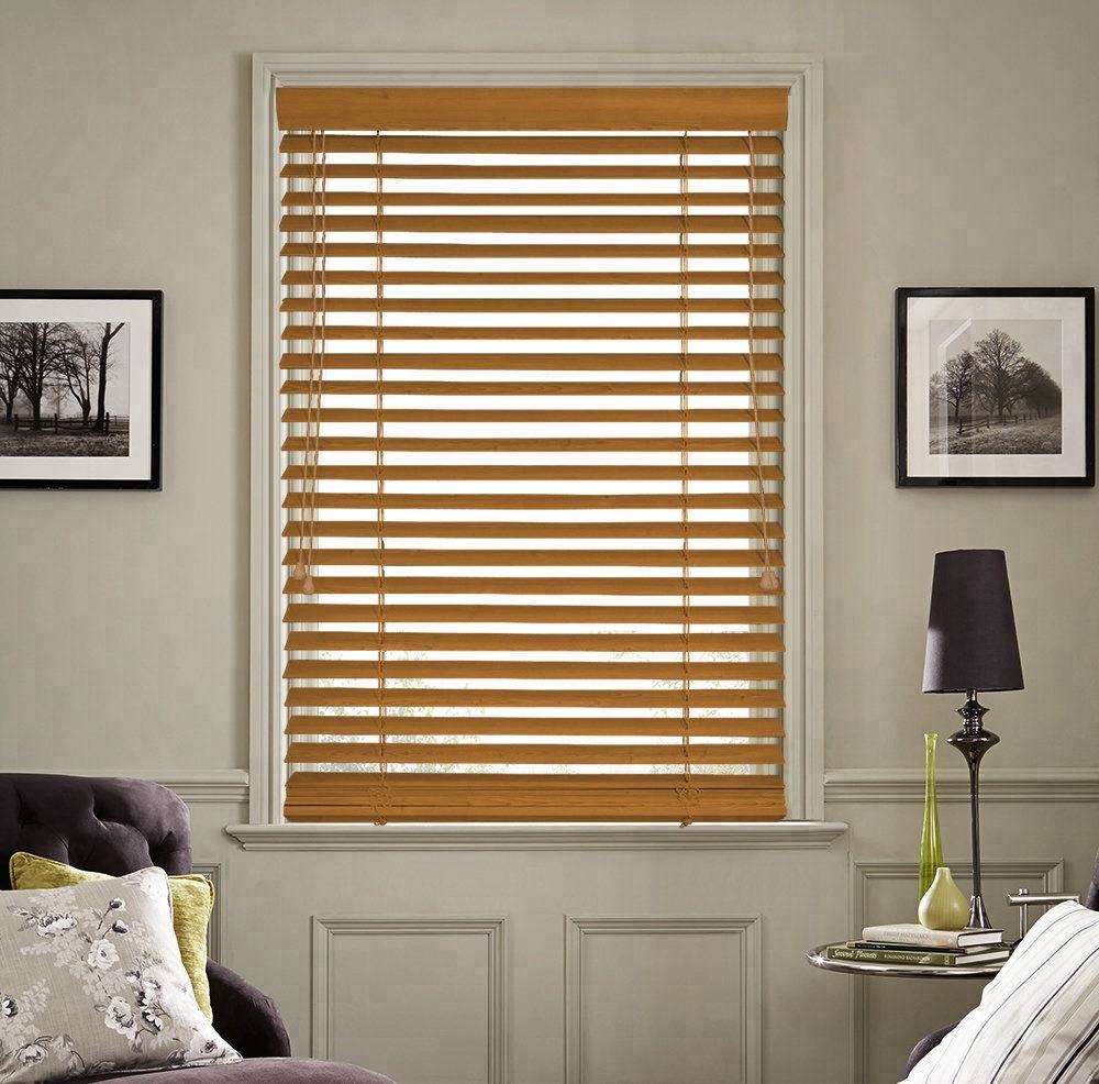
Natural and artificial lighting can completely change how a blind appears. A soft grey may look cool and crisp in a showroom but appear warmer in a sunlit living room.
Before purchasing, always check how your room behaves throughout the day. Morning light, midday brightness, and evening indoor lighting all influence perception.
For practical guidance on how window coverings interact with light, resources like the U.S. Department of Energy explain how treatments impact both visibility and energy efficiency.
Always Request Fabric Samples Before Buying
One of the most reliable ways to avoid colour mismatch is to order samples. Screens cannot accurately represent texture, sheen, or depth of tone.
Place samples against your wall paint, furniture, and flooring. Move them around the room at different times of the day to see how they respond to changing light.
We offer a wide range of blind styles where sampling helps ensure accuracy before purchase, including options like roller designs available here:
Match Undertones, Not Just Colours
A common mistake is focusing only on the surface colour. Every shade carries an undertone, whether warm, cool, or neutral.
For example, a white blind may lean slightly yellow, blue, or grey. If it clashes with your wall undertone, the mismatch becomes obvious even if the colours seem similar at first glance.
To achieve harmony, compare undertones under natural daylight rather than artificial lighting. This helps you avoid subtle clashes that become more visible after installation.
Consider Texture And Fabric Finish
Colour is not only about hue, it is also about material. Matte finishes absorb light differently compared to glossy or textured fabrics.
A textured blind may appear darker because it breaks light across its surface. Meanwhile, smooth fabrics tend to reflect more light, making colours appear brighter.
Exploring different material options helps you refine your choice, especially when coordinating with existing décor elements like cushions, rugs, or curtains. We offer a variety of curtain styles that can help balance texture across a room:
Use Neutral Colours For Flexibility
If you are uncertain, neutral tones such as whites, beiges, and soft greys offer long-term flexibility. They adapt easily to future décor changes without clashing.
Neutral blinds also help maintain visual balance in busy interiors. They allow furniture and accent colours to stand out without overwhelming the space.
For homeowners who prefer guidance when selecting finishes, professional consultation can simplify the decision-making process. You can reach out here for tailored advice:
Test Digital Visualizers Carefully
Online visual tools are helpful, but they should not be your only reference. Device screens vary widely in brightness and colour calibration.
If a brand offers a visualizer, treat it as a guide rather than an exact representation. Always cross-check with samples or real-life references before confirming your order.
Industry experts on platforms like HGTV also highlight the importance of real-world testing when choosing window treatments.
Coordinate With Existing Interior Elements
Blinds should not exist in isolation. They must complement walls, flooring, furniture, and décor accents.
Start by identifying dominant tones in your room. Then choose blinds that either blend seamlessly or provide intentional contrast.
A well-balanced room usually follows a consistent colour story, where no single element feels visually disconnected. This approach ensures long-term satisfaction with your design choices.
FAQs
How Do I Know If A Blind Colour Will Match My Room?
Always test samples in your actual space. Observe them under different lighting conditions before making a final decision.
Do Online Blind Colours Look Different In Real Life?
Yes, screens often distort colour due to brightness and resolution differences. Physical samples give a far more accurate representation.
What Is The Safest Blind Colour To Choose?
Neutral shades like white, beige, and light grey are the most flexible and work across most interior styles.
Can I Match Blinds With Wall Paint Exactly?
Exact matching is difficult due to undertones and lighting. It is better to complement rather than match perfectly.
Are Fabric Blinds Better Than Vinyl For Colour Accuracy?
Fabric blinds offer richer texture and depth, while vinyl provides more consistent flat colour. The choice depends on your design goal.
Final Thoughts
Selecting the right blind colour online is less about luck and more about process. When you understand lighting, undertones, and texture, your decisions become far more accurate and confident.
Taking the time to compare samples and evaluate your space ensures a result that feels intentional and well-balanced. The right blinds do more than cover a window, they complete a room.
If you are ready to refine your space with confidence, explore our full range and take the next step toward a perfectly coordinated interior.
