


Blinds
Best Colors for Blinds Available Online
Key Takeaways
- Neutrals like browns, greys, and storm tones offer timeless versatility.
- Accent tones such as green and beige can enhance mood or complement décor.
- Curtain Master provides an expansive color palette across materials—PVC, aluminium, faux‑wood, Zebra—to suit any style.
Available Color Ranges on Blinds
Browsing the Curtain Master blinds category reveals a thoughtfully curated colour spectrum :
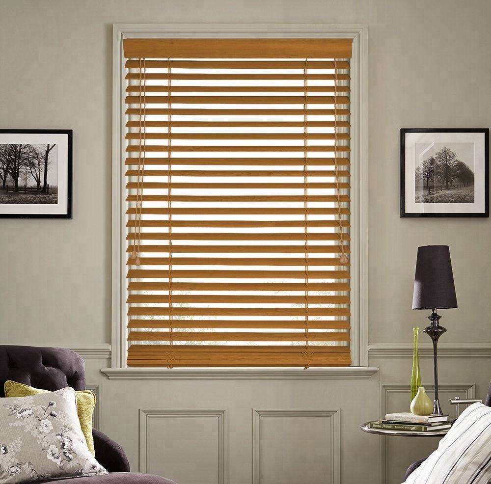
- Browns (6 variants): Warm wood tones that add depth and natural appeal.
- Greens (1 variant): A fresh, botanical accent with a calming presence.
- Greys (2 variants): Sleek, modern neutrals perfect for minimalist spaces.
- Storm (1 variant): A bold, deeper tone for dramatic contrast.
These options combine timeless elegance with the ability to shape atmosphere in any room.
Matching Neutral Slats to Interiors
Neutral tones offer design flexibility and longevity:
- Browns work beautifully with wood furniture and natural décor.
- Greys complement industrial, monochrome, or Scandinavian styles.
- Storm is ideal for accent walls or moody, cinematic interiors.
Curtain Master sources slats in finishes that mimic timber or matte metal, ensuring harmony with your home’s aesthetic.
Accent Colours for Statement Pieces
Strategic accent tones add personality:
- The single green shade introduces botanical freshness without overpowering.
- Use accent blinds in small doses—on one window or within a room zone—to energize the space.
This carefully selected palette supports bold design without overwhelming.
Material and Colour Pairings
Different blind types showcase these shades in unique textures:
- Aluminium Blinds (25 mm) present crisp greys and storm with metallic sheen.
- Faux‑Wood PVC Blinds echo brown woodgrain textures in PVC form .
- PVC 25 mm Blinds blend practical PVC with realistic wood tones—ideal for humid rooms.
Curtain Master ensures each material-colour pairing enhances both function and design.
Zebra Blinds: Soft Neutral Choices
In the Zebra blind range, soft neutrals dominate:
- Options like beige, dark grey, light grey, black, and Clara Zebra bring layered textures.
- These shades offer combined light control and style—suiting minimal, eco, or bold interiors alike.
Blended stripes in these neutral tones bring depth and visual interest.
Effect of Colour on Light and Mood
Color selection affects ambience:
- Lighter tones such as light grey and beige maintain brightness and openness.
- Darker hues like dark grey, black, or storm create drama, better for media or bedroom spaces.
- Medium tones like browns balance light, impart warmth without absorbing it.
Curtain Master guides clients in choosing hues aligned with desired light and energy.
Design Tips by Room
Choose shade based on room use and design scheme:
- Living rooms: medium browns or greys harmonise with wood décor.
- Kitchens and bathrooms: faux‑wood PVC offers humidity resistance in neutral wood tones.
- Bedrooms/media rooms: dark storm or black Zebra bring blackout and cosy feel.
- Home offices: light neutral greys support focus while reducing glare.
These options support function and style simultaneously.
Layering with Other Window Treatments
Blinds offer flexibility when layered:
- Pair a grey blind with sheer neutral curtains for softness and light diffusion.
- Combine a brown faux‑wood blind with a beige roller for warmth and texture.
- Use a black Zebra blind with blackout curtains for enhanced privacy and design contrast.
Curtain Master ensures color coordination across layered window treatments.
Choosing Based on Furniture and Floors
Link blinds to existing interior elements:
- Match brown blinds with timber floors or wooden furniture.
- Coordinate grey tones with concrete, metal, or modern textiles.
- Pair green accents with indoor plants or botanical décor for cohesion.
This visually unites your window treatments with the overall décor.
Colour Psychology & Emotional Effect
Subtle color choices influence mood:
- Green evokes calm and wellbeing.
- Grey creates a balanced, neutral backdrop.
- Storm or black introduces elegance and serenity.
Curtain Master advises aligning color selections with emotional ambience goals.
Practical Considerations for Colour Selection
Beyond aesthetics, keep these in mind:
- Darker tones absorb heat—use blackout insulation blinds to manage temperature.
- Light colours reflect light—ideal for sun-facing rooms.
- Contrast between slats and walls frames the window; matching hues blend windows into décor.
Selecting the right color supports both comfort and design integrity.
Ordering and Customisation Online
Curtain Master simplifies the blind-order process:
- Colour filters include Browns, Greens, Greys, Storm for easy browsing.
- Custom options in Zebra, PVC, faux‑wood, and aluminium offer tailored style.
- Detailed product images help assess color in different lighting conditions.
This clarity ensures confident, informed decisions.
Maintaining Colour Quality
Preserve your blinds’ look with care:
- Dust regularly to prevent grey haze on light-colored blinds.
- Clean faux‑wood slats with damp cloth to maintain brown tones.
- For Zebra blinds, check alignment often to avoid fading from uneven sun exposure.
Curtain Master includes care guidance to support colour longevity.
Summary Design Checklist
- ✅ Choose a base neutral colour (brown, grey, storm).
- ✅ Add accent colour (green or dark tone) to highlight.
- ✅ Match material (aluminium, PVC, faux‑wood, Zebra) to room use.
- ✅ Coordinate blinds with walls, floors, and furnishings.
- ✅ Combine blinds with curtains or sheers for texture.
- ✅ Balance light and privacy needs through colour choice.
- ✅ Purchase online using filters/browse features.
- ✅ Maintain your blinds to retain colour and function.
Curtain Master’s online range empowers clients to style window treatments that serve function while delivering striking visual impact.
Curtain Master provides a refined palette of blind colours—neutrals with nuance, accent opportunities, and material-specific textures—all available online. These well-chosen hues fit a variety of interior themes, balancing light, warmth, privacy, and design continuity to elevate your home’s ambience.
